Blank Spaces S.r.l.
DESIGN CONCEPT
CONCEPT
Salice’s rebranding was conceived not as a change of identity, but as an evolution of it. Approaching its 100th anniversary, the challenge was to transform a century of engineering expertise, innovation and industrial culture into a contemporary brand capable of expressing where the company wants to go next.
At the heart of the new positioning is a simple idea: Salice does not simply manufacture components; it enables movement and the experience of furniture. Technology becomes invisible yet essential, transforming complexity into fluidity, precision and everyday quality.
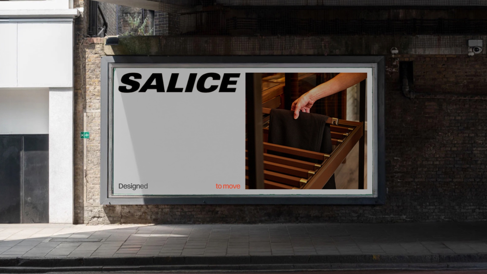
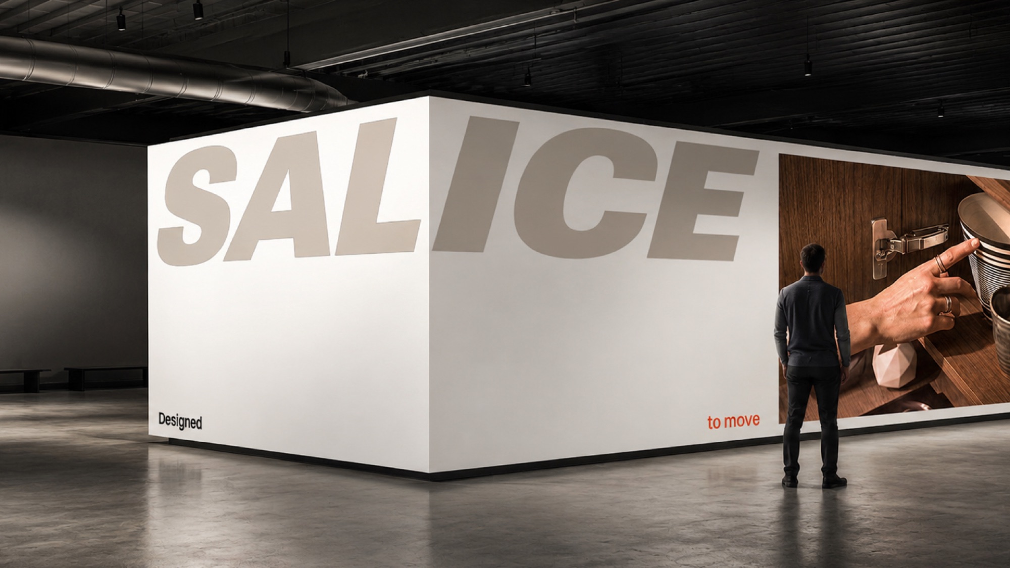
This idea is encapsulated in the new claim, “Designed to move”: a statement rooted in what Salice has always done, while opening the brand to a broader, more emotional and future oriented meaning.
CONTEXT
The centenary represented a strategic moment to look beyond Salice’s history and define the role the company wants to play in the next chapter of its evolution.
The project began with an extensive brand strategy process, developed through workshops involving key people and different areas across the company. This collaborative approach helped bring together multiple perspectives, uncover Salice’s shared culture and translate its technical heritage into a clear purpose, mission, vision, values and positioning.
The result was a shift in perception: from component manufacturer to premium technical partner, capable of supporting designers, manufacturers and clients throughout the entire process and of transforming innovation into integrated, industrially viable solutions.
Rather than celebrating one hundred years as a destination, the new brand uses them as a foundation for the future.
EXECUTION
The strategic work was translated into a comprehensive identity system designed to create consistency across every expression of the company.
The existing Salice logo was not replaced, but given a stronger and more confident role. Its inherent sense of movement became a fundamental part of the visual language, extending into motion principles where the logo itself opens with a slow, controlled movement inspired by the tactile experience of Salice products.
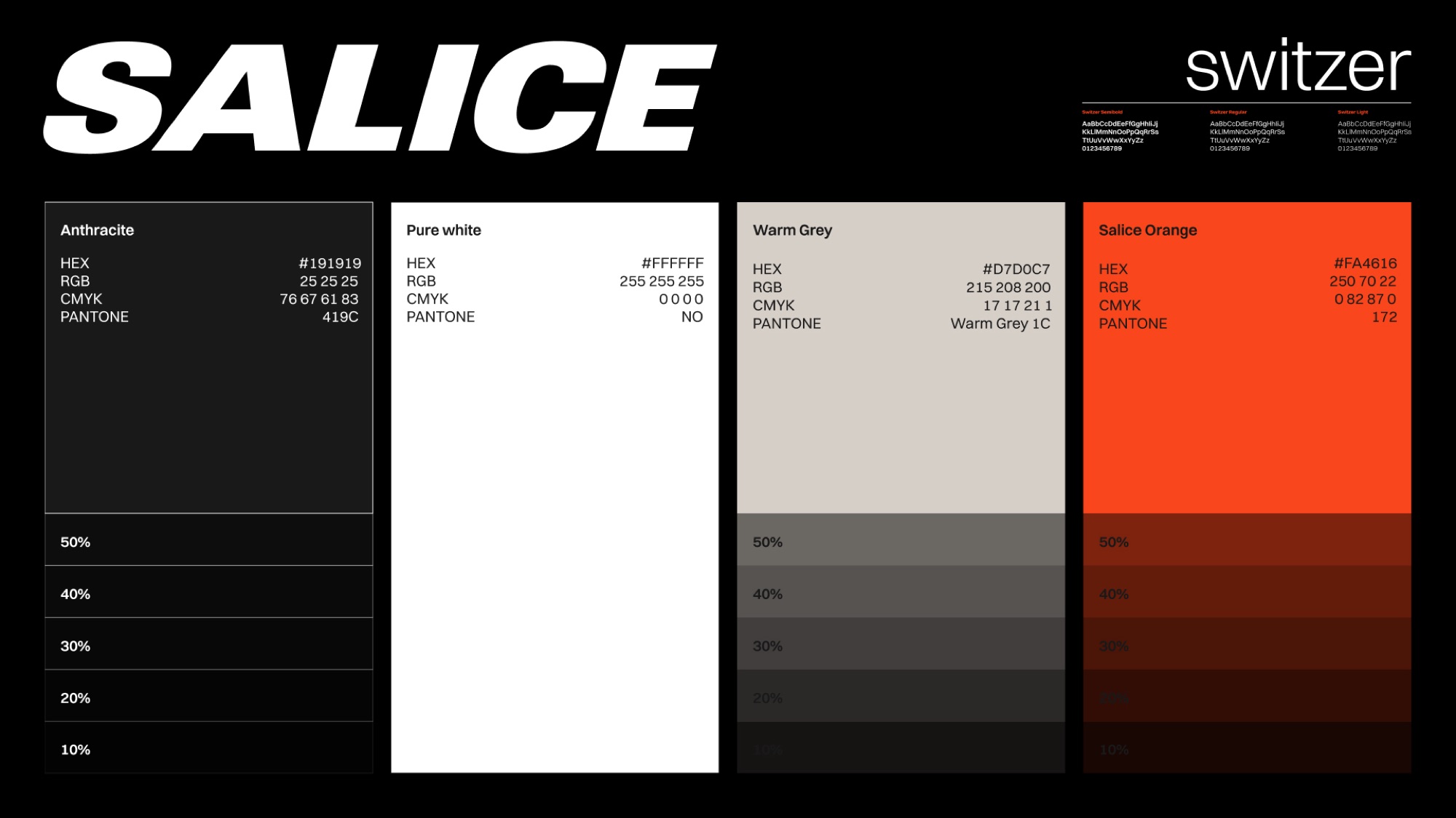
A new visual ecosystem was developed around it: a more sophisticated and technical colour palette, a precise typographic system and an image direction built around three dimensions: products, interactions and context, moving the communication from the component itself to the experience it enables.
The same concept of movement informs layouts and editorial compositions, where graphic elements move dynamically across the grid rather than following a rigid structure.
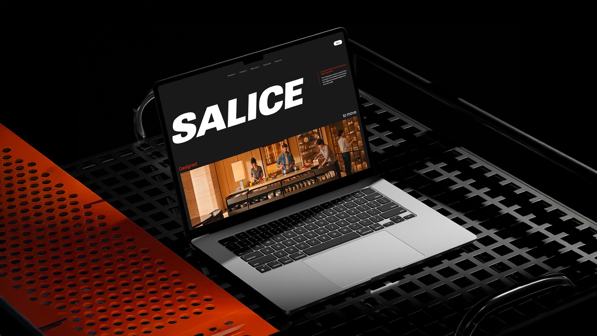
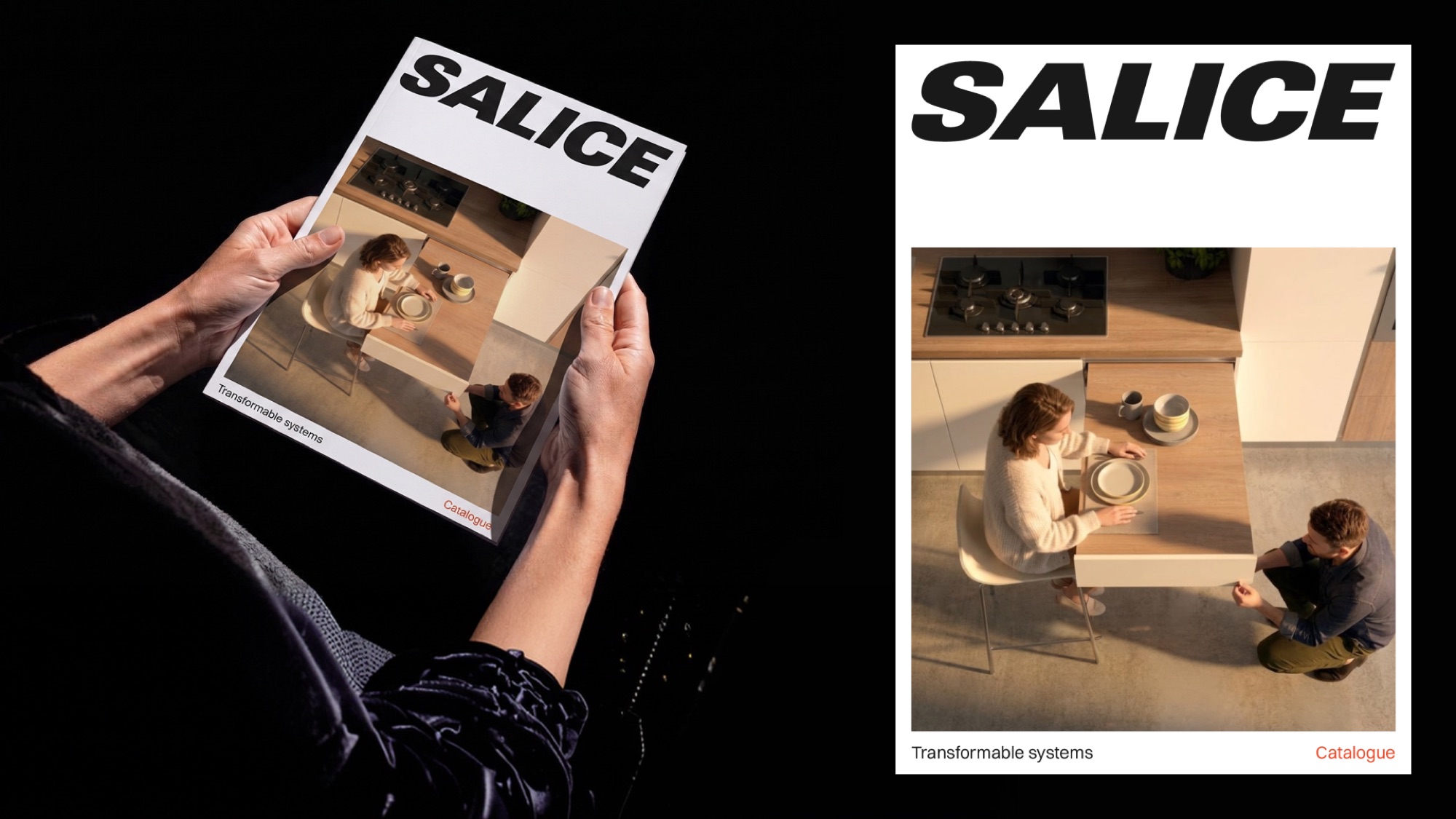
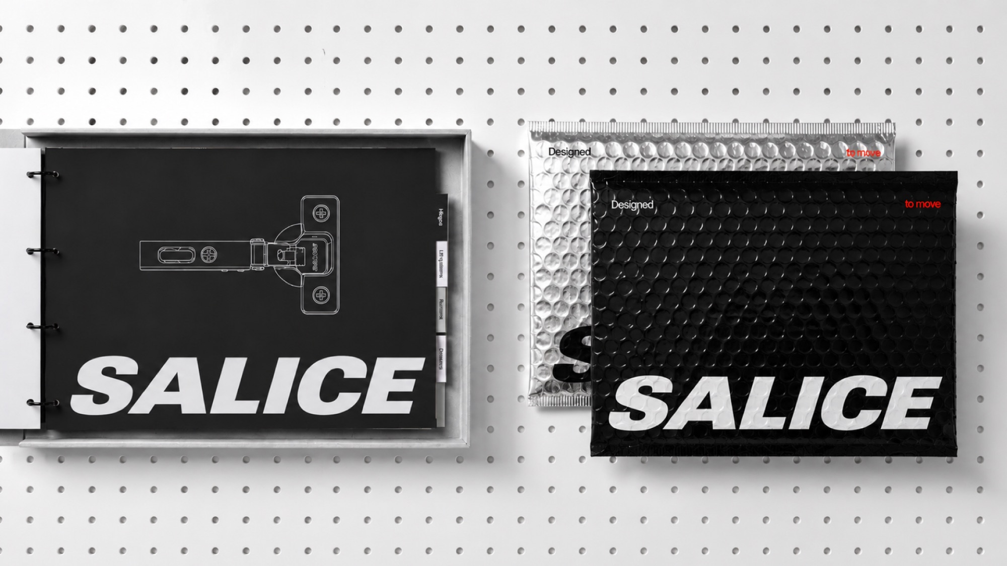
The result is not simply a new visual identity, but a coordinated brand system that regulates communication and sales tools across physical and digital touchpoints: corporate materials, catalogues, product communication, digital platforms, exhibitions, advertising and branded environments.
IMPACT
The main impact of the project is therefore one of positioning and alignment.
The rebranding provides Salice with a shared language through which almost one hundred years of expertise can be communicated consistently across markets, departments and touchpoints. It connects engineering precision with design culture, technical authority with a more human perspective, and product excellence with the experience that Salice makes possible.
Most importantly, the project creates a framework for the future: a system designed to evolve together with the company as Salice moves from being perceived primarily as a component manufacturer towards its ambition of becoming a global reference for premium furniture solutions and a systemic partner for the industry.
One hundred years of expertise became the starting point, not the destination. Designed to move into the next hundred.